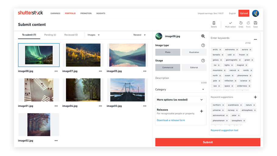
Kate Shutterstock Posted February 9, 2017 Share Posted February 9, 2017 Hello Everyone, Today we are delighted to announce the introduction of the new redesigned contributor dashboard to provide you with more insight into your sales on Shutterstock. This new dashboard provides a more detailed, customizable view of your earnings, right from the front page. Using different filters, you can track earnings by content type, by month and by license type. In addition, we have added a Top 5 Performers right at the heart of your dashboard so you can easily see your most successful images or videos. Thank you for your continued commitment to Shutterstock. We value your contributions and are proud of the marketplace we are building together. Thank you Kate Link to post Share on other sites
Joe Ravi Posted February 9, 2017 Share Posted February 9, 2017 I liked the new dashboard! Link to post Share on other sites
Alexlky Posted February 9, 2017 Share Posted February 9, 2017 I wish I could have more than 2 thumps to gave it many ups! Link to post Share on other sites
FrontlitPhotography Posted February 9, 2017 Share Posted February 9, 2017 I like it. Link to post Share on other sites
Helen Hotson Posted February 9, 2017 Share Posted February 9, 2017 It's really nice. Link to post Share on other sites
Jane Rix Posted February 9, 2017 Share Posted February 9, 2017 I like it too, although it will take a little getting used to. A small request though, if it's possible to implement easily? The profile strength at the top of the page tells me I am at 90% and I should add my Social Media accounts. I have added all I have, as I'm not on Tumblr or Google+. Can we have an option to hide this reminder, as I don't like to be constantly prompted to change something that doesn't need it. Link to post Share on other sites
art_of_sun Posted February 9, 2017 Share Posted February 9, 2017 Why??? Why you made this? No week statistics, no portfolio views, no followers, no previews of uploaded and submitted files, but giant numbers of All time earnings/downloads and it necessary to scroll to see the map! Totally dislike! Link to post Share on other sites
Patryk Kosmider Posted February 9, 2017 Share Posted February 9, 2017 This change is great!!! I love it a lot. Upgrade of map is the best with cities and countries of download. But on mine the number of pending files to approval showing 0 when there is 16 files waiting... Still don't like the daily earning page. Please go back to one page!!! Link to post Share on other sites
Joe Ravi Posted February 9, 2017 Share Posted February 9, 2017 I have one small request, currently the font size is approximately 36 for Unpaid Earnings, Total Earnings and Total Downloads. Reducing it might be a good idea. Link to post Share on other sites
Chatcharin Sombutpinyo Posted February 9, 2017 Share Posted February 9, 2017 Well done. Link to post Share on other sites
David A Litman Posted February 9, 2017 Share Posted February 9, 2017 OK, but I think there is room for improvement; 1. I liked the map at the top. As it is now, you need to scroll down to see it, and you miss the first few dl's, unless you're really fast. 2. I miss seeing pending images at a glance. 3. "unpaid earnings" doesn't need such a big box, as it's already neatly tucked in right upper corner. Link to post Share on other sites
Natalia Hubbert Posted February 9, 2017 Share Posted February 9, 2017 Hello Everyone, Today we are delighted to announce the introduction of the new redesigned contributor dashboard to provide you with more insight into your sales on Shutterstock. This new dashboard provides a more detailed, customizable view of your earnings, right from the front page. Using different filters, you can track earnings by content type, by month and by license type. In addition, we have added a Top 5 Performers right at the heart of your dashboard so you can easily see your most successful images or videos. Thank you for your continued commitment to Shutterstock. We value your contributions and are proud of the marketplace we are building together. Thank you Kate Kate, Thanks for the announcement. New Dashboard looks good! I guess it will take some time to test it and to see and understand what benefits our work and what not. So far I like it! Not sure if we need the TOTAL EARNING that big or if we need it on the front at all. Don't see the point. Talking about sales on Shutterstock. I got about %40 drop in my earning since November. I'm afraid I won't need much insights into my sales soon due to not a great deal of sales. Talking about how much you value contributors. It is certainly nice to hear from you again. Perhaps you will find few minutes to read contributors opinion and suggestions on Refreshed Earnings Pages Coming Soon Contributors simply don't like it and don't find it useful or handy. The same about new Top sellers - we can't see the selling stats for the new content anymore. Kate, PLEASE, bring the old pages back. Or at least respond and tell us that you guys are working on it. Many Thanks for your work! Link to post Share on other sites
Mimma Key Posted February 9, 2017 Share Posted February 9, 2017 (edited) ok, i like it, even tho im used to old one, but still one complain - pending approval/not yet submitted/recent rejections are missing thumbnails. Also, something happened with map, it is less clear and transparent with all last 10 downloads and, some IPs are different. for instance, i have someone from same ip downloading regulary from me, now, their downloads are spread all over the map (which essentially doesnt make difference in earnings, but still its nice to know when same buyer is downloading pics). Also, it would be nice to make font smaller and to bring map on the top of the page like it used to be. Map is to messy right now, and it should be on the top of the page Edited February 9, 2017 by HiddenCatch Link to post Share on other sites
dirkr Posted February 9, 2017 Share Posted February 9, 2017 It looks nice, but there are some things that were better in the old version or could be improved: It's too big to fit on the screen, I'm forced to scroll down to e.g. see how my sets are performing. There's no way any more to see how new files are performing (the ability to show downloads from files uploaded the last 3 / 6 months is gone). It does not remember settings I choose. I'd like to show the current month's earnings in the "earnings summary", but that choice is gone again if I leave the site and reopen it. Some proposals: Make the screen setting configurable (what parts to display where on the screen) and provide an ability to save those individual settings Provide a list of last downloads, with the most recent one on top. Currently it's hard to quickly see new sales. Provide a simple list of the whole portfolio, sortable by downloads, money earned, date uploaded (like the "top performers" but sortable by all columns and including files without sales) Link to post Share on other sites
DwaFotografy Posted February 9, 2017 Share Posted February 9, 2017 Looking at last changes this one is definitely the best one. Of course there is a room for improvements but still, I like it very much. Please just redesign earning pages. Link to post Share on other sites
Akura Yochi Posted February 9, 2017 Share Posted February 9, 2017 Where are ... graphs of summary downloads per week graphs of summary new content downloads per week graphs of summary visits number per week it is necessary that all these things should have. Link to post Share on other sites
Roberto Castillo Posted February 9, 2017 Share Posted February 9, 2017 where is "earnings" by new files? It's help to know how to work in future I miss the images of "pending of aproval and not yet submited" go to "Approval Status" is a very old idea. I prefer old page, list of pending images, edit or delete. Because if you make 4 diferent uploads and you have to edit/delete/release files you need to move over a text list with no images (very bad idea) with all changes, desktop and ernings table....How many contributors has been consulted. In general (in my opinion) the changes has been made by designers not by contributors.It's as if the design was more important than utility. Link to post Share on other sites
Ajgul Posted February 9, 2017 Share Posted February 9, 2017 I dont like the new design. The only positive thing is that the map is showing cities now. Where can I see earnings weekly? There are no preview in pending and to be submitted images. I dont need to see my total earnings everytime. And I dont need my 5 top performers on the first site. The statistic is not contributer friendly now, I can not analyse quickly, how good the sales of new images are. The new design may look well but is totally not contributer friendly! Please bring the old version back or change this design Link to post Share on other sites
Jochen Netzker Posted February 9, 2017 Share Posted February 9, 2017 I like the new map with the locations with city and coutry. One remark, when you change some of the statistiks, when you refresh the side, everything is back to normal. Could it save the changes? Link to post Share on other sites
Algol Posted February 9, 2017 Share Posted February 9, 2017 I don't like it. It shows nothing new that is of any use to me and is very messy and cluttered. I'll be sticking to 3rd party software for all dealings with SS from now on. Much simpler and more streamlined and efficient. Link to post Share on other sites
LEE SNIDER PHOTO IMAGES Posted February 9, 2017 Share Posted February 9, 2017 Bluntly put, as the old saying goes, "If it ain't broke don't fix it." I regret to say the new earnings page is really horrible, confusing, and takes more clicks and time to utilise. Why photo stock agencies keep playing with their websites and making them more cumbersome is a total mystery to me. Sorry, but this is NOT an improvement for Shutterstock contributors, it is a nuisance and not at all useful. Link to post Share on other sites
Jagerion Caiph Posted February 9, 2017 Share Posted February 9, 2017 Why??? Why you made this? No week statistics, no portfolio views, no referrals, no previews of uploaded and submitted files, but giant numbers of All time earnings/downloads and it necessary to scroll to see the map! Totally dislike! Agree. Previous design was more informative. Once again. Why trying to fix what isn't broken? Also tab "Additional resources" takes a quarter of the page, though it not even related to sales. Leave those blogs out of contributor page (it's interesting but it's not necessary for daily view/ isn't statistics)... and bing back weekly sales and visits. Link to post Share on other sites
Natalia Hubbert Posted February 9, 2017 Share Posted February 9, 2017 ...I would prefer without too big Blog announcements. Perhaps if you could move it in the bottom it will be better... ...Also it would be nice to see the monthly earning a bit more further back than just 12 months. Now contributors can't get upset when they see that their monthly earnings from few years ago were way higher than now! lol)) On the other side... We are writing our comments and opinions here... I'm wondering if does it really matter?))) The other hot topic got 16+ pages just in few days. And still no respond on that subject... Meh... Link to post Share on other sites
Swill Klitch Posted February 9, 2017 Share Posted February 9, 2017 Ok, new profile page. 1. I want to see previews of Pending files 2. I want more place for recently approved 3. I don't need Additional Resources at all. At least, make it small. 4. Announcements is fine. But nobody will see it 5. Profile block with my logo/face - I don't need it at all. You could make it small and put at the bottom. Useless information. 6. Unpaid Earnings - it's fine when it is a small number on the grey line (please, don't remove it!). I can see it perfectly. Block is completely useless. 7. Earnings Summary. Fine, but must be much smaller. I can't open the page in public place anymore. Also, I just don't need it this big. 8. Monthly Earnings - where is the options? This is so nothing! 9. Map. Map is better (except it cuts the preview). The only better thing. But it must be №1! Why is it 9? This is SS unique feature, everybody loves it! And you put it at the bottom, BELOW THE SCROLL? 10. Sets is fine, because you did not changed it 11. Top performers - actually, great tool. But it needs a lot of work to become really useful. What can I say... Welcome to the new era of UI fixing userscripts, adblock tuning and third-party analytics! For the last week I found and learned to use A LOT of things, I never heard before. Thanks, Shutterstock! Link to post Share on other sites
Recommended Posts
Create an account or sign in to comment
You need to be a member in order to leave a comment
Create an account
Sign up for a new account in our community. It's easy!
Register a new accountSign in
Already have an account? Sign in here.
Sign In Now